From the Field: Rachel Cohen on Mitchell’s Multipanel Works

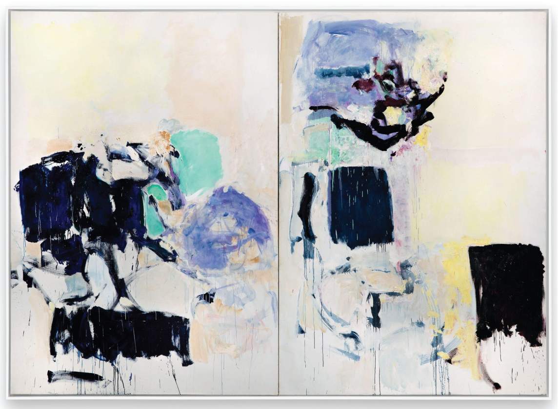
“I first fell for Mitchell’s paintings at the Whitney Museum of American Art’s retrospective in 2002, and it seemed natural to return to her twenty years on, as I have been writing a book about how artists work with time: time slipping away, time divided by technology, rejoining the flow of time. Mitchell’s adjoined panels, I thought, compress a series of canvases into one work and evoke a sense of passage, as a Claude Monet series showing the same haystacks in different light gives the hours, or as a sequence of Japanese woodblock prints gives the seasons of the year. I was eager to see those panels Mitchell had carted around her studio.”
In an essay for Yale Review, Rachel Cohen describes her year of researching Mitchell, from road trips to see multipanel paintings near her home base of Chicago, to study trips to the Joan Mitchell Foundation, where Cohen immersed herself in Mitchell’s letters.
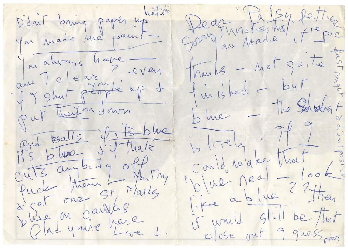
“Gradually, I realized that the look of the letters was, in fact, very much like Mitchell’s brushstrokes. I was struck by the sprawl of writing across the paper, her thoughts connected with long dashes, how she interrupted herself to swear or exclaim, and made significant words larger for emphasis. In one blue ballpoint note to Patricia Molloy, a social worker and close friend, she underlined the word blue so that it spattered across two pages like blue paint: on the left, ‘if its blue its blue’; on the right, another ‘blue’; and lower down, ‘blue ? ?’
“Mitchell was a good letter writer, too—forceful, veering, incisive. I knew she had been close to New York school poets, and had named paintings with Frank O’Hara’s poems in mind. But now it occurred to me that her witty, personal titles were like lines from New York school poems: George Went Swimming at Barnes Hole, but It Got Too Cold; The Good-Bye Door; No Rain; They Never Appeared with the White.”
Rachel Cohen is a writer and Professor of Practice in the Arts in creative writing at University of Chicago. Read the full essay on Yale Review.